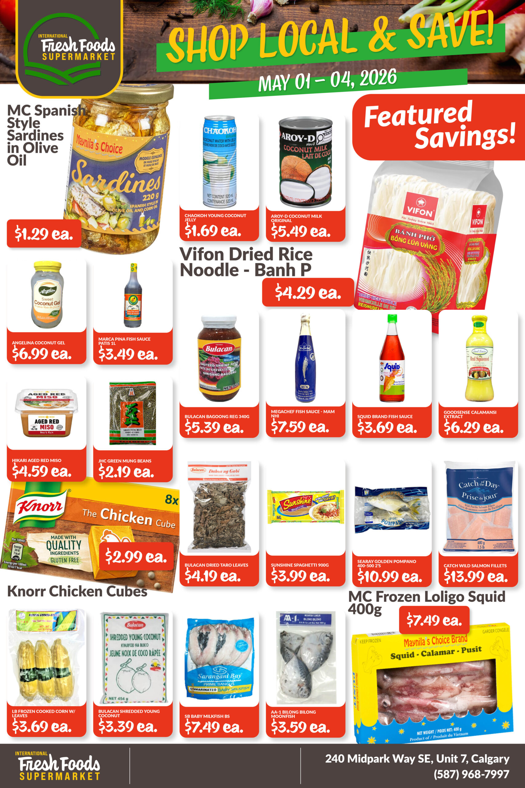
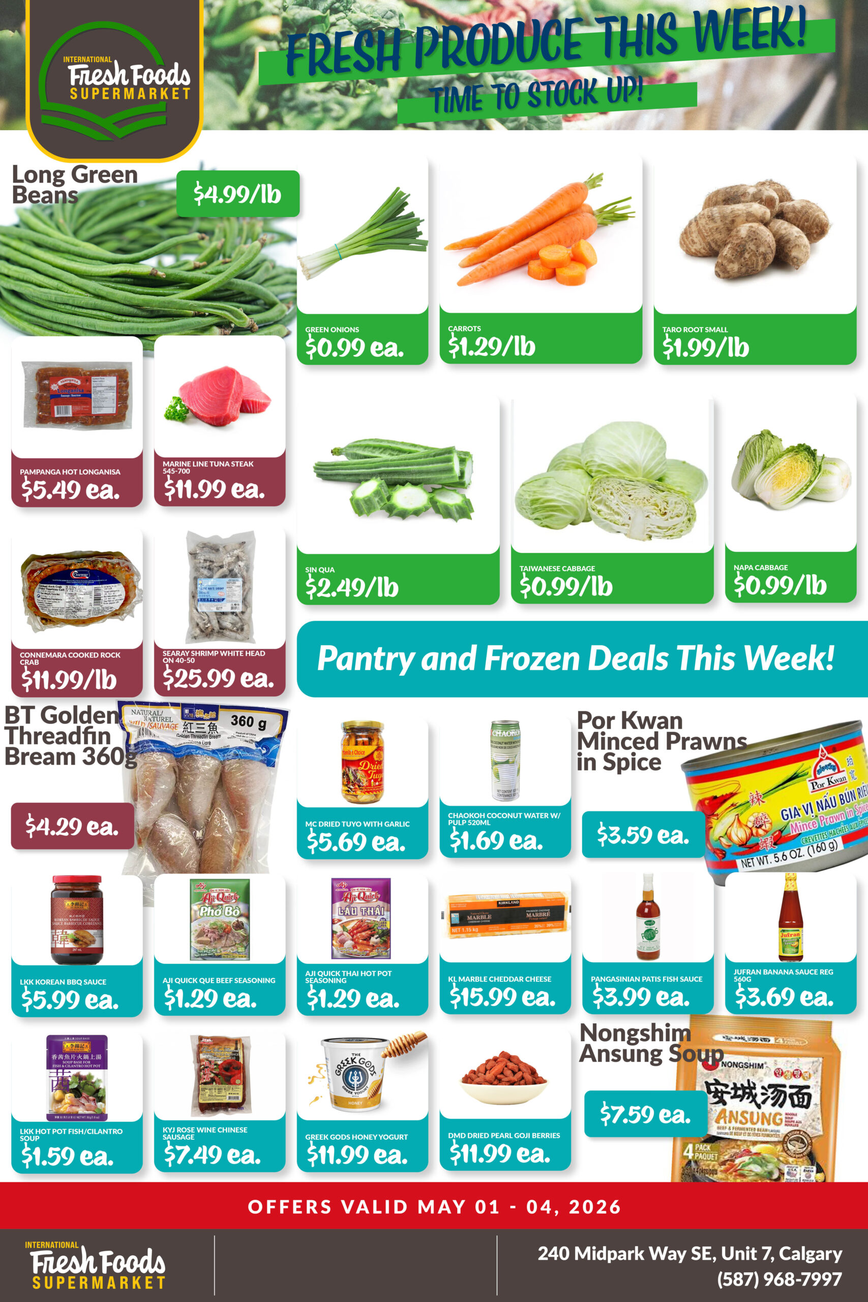
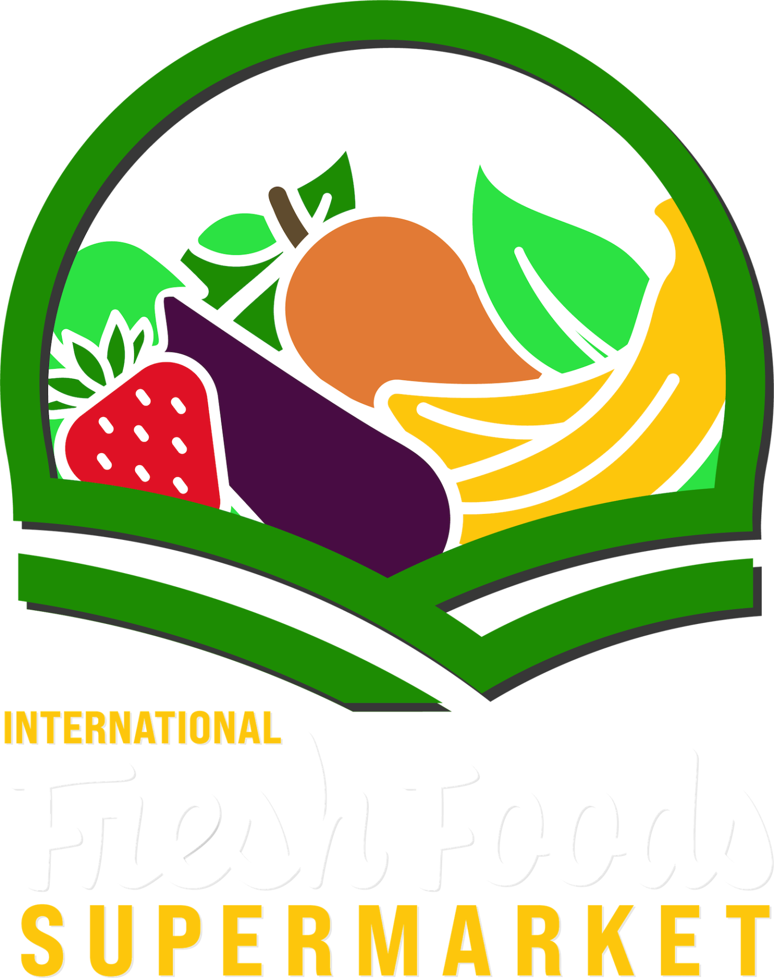
The logo design for International Fresh Foods Supermarket was a unique proposition. The new Asian Market, which opened in Midnapore in 2022, had an existing logo design that was done in a hurry with the opening of their new store. The current logo didn’t meet all of their needs, though, and they required a new logo with elements of the old to tie the existing signage to the new design. We worked on a custom font, a new layout, and redesigned the graphic elements to fit with their existing signage, while giving them a lot of new and unique layout options. The new logo design bridges the old with the new, and will give the market some more cohesive options for the future.


Following the development of the new logo, International Fresh Foods Supermarket required ongoing design support to bring consistency and clarity to their weekly promotions and in-store experience. With a high volume of products and frequent updates, the materials needed to be flexible, easy to navigate, and visually engaging. We developed a structured system for their weekly digital flyers, balancing bold pricing, clear product hierarchy, and strong colour coding to help customers quickly find key items. This system is adapted each week across social media, maintaining a consistent look while accommodating a wide range of products and categories. In addition to the flyers, we created supporting digital assets including category headers for their online shop, helping to extend the brand across customer touchpoints. The result is a cohesive set of materials that supports both day-to-day operations and ongoing promotion.